|
Welcome /
trash welcome you here into her thoughts she welcome any interested parties to hire for freelance be it branding,motion graphics or any forms of video making. mgbd nyp drop her a email at artaz_aq@hotmail(dot)com for anything that needs a password: trash This site is best viewed in 1280x768, Mozilla Firefox View My Stats Tagboard /
Links /
pohfong audrey sister chow fern shawna hui xiang agnotti serene ernie evol natasha daniel nique marcus qing he jasmine randy jia en cherine yiling Archives /
April 2007May 2007 June 2007 July 2007 August 2007 September 2007 October 2007 November 2007 December 2007 January 2008 February 2008 March 2008 April 2008 May 2008 June 2008 July 2008 August 2008 September 2008 October 2008 December 2008 March 2009 April 2009 August 2009 Recent
moved!! because of problems publishing post at blo... been wondering and day dreaming for too long. I re... This excellent work is from 25 y.o Russian photogr... !Motion graphics.part 1Long time never really upda... Seeking out the beauty from withintime portrays th... Stillness interesting composition from show57. Very mtv for ... Chief Creative Officers of Ogilvy & Mather help yo... love the use of raw and colorful dynamic lines to ... Credits /
This skin is produced by Headlight Productions. The icons are from Three More Steps. All codes are meticulously hand-coded, and can not be used as basecodes or reference. All css and javascript in the code passes validation.© Copyright Headlight 2008 - Forever. All Rights Reserved. |
//Thursday, May 24, 2007 11:47 PM
The 'Haru' Ad that i did in class today.
The initial idea wasn't this at all.But as i progressed and explore After Effect, the idea of using papercut strucked me. Why paper doll: 1) paper dolls are things that u create. I wanna show that ppl can create their own style too by mix-matching different type of clothes. 2) The Process of creating is really fun and enjoyable. I showed it Ms Tina and she showed me another clip.This time round the paper dolls are in 3D forms and harder to achieve. After looking at the ad i produced for this week. I found that the spinning apple at the beginning is actually quite redundant.I should focus more on the clothes cos some of my frens feel that i'm selling apples at the beginning. =__=lll While bathing i tot of another idea but i forgot liao... DIE!!
//Wednesday, May 23, 2007 6:09 PM
Bah bahbah i dunno wat my advertisement will be abt.Trapped in the mac lab without water and friends to talk to.SIAN...
My advertisement is all abt random scene that i took WITHOUT any story/storyboard.Haha, feeling abit scared scared sia. First time do video without planning.But i found that all those fashion advertisement do not have any story at all.Most of them are just selling the idea den the clothes itself.Mine is almost the same too.Mine because is gothic lolita so i got to persuade ppl to sell the identity rather den the clothes itself. That means that i got film something give ppl "OMG" feel, to make wanna get it... Damn... I really dunno wat i'm talking abt. Feeling abit lost...
//Monday, May 21, 2007 10:38 PM
//Sunday, May 20, 2007 11:54 PM
// 10:12 PM
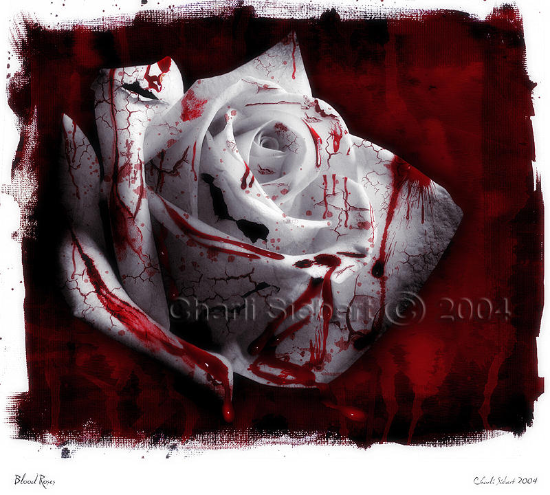
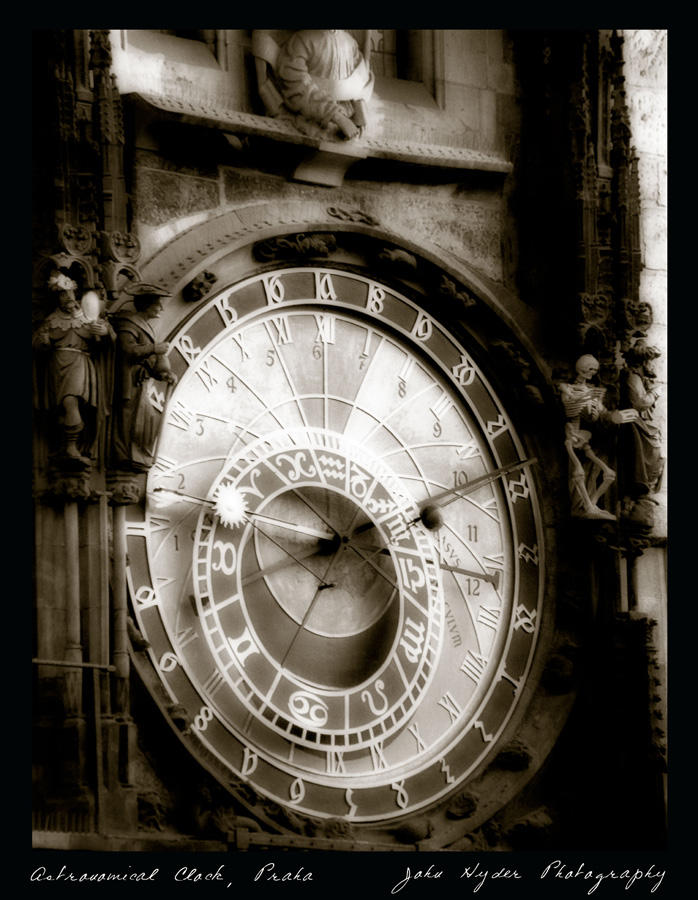
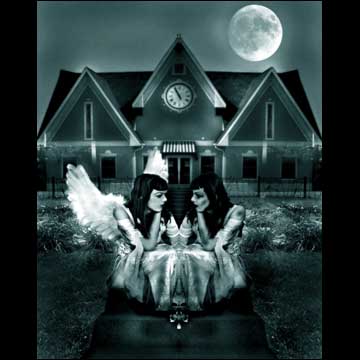 the differences and similarities between Black & White Cuteness & Madness Gracefulness & Darkness  Playing with positive and negative space Playing with positive and negative spaceWill have to make sure that it will give the audience with a sense of "OMG!! i wanna get one of these too!!" that kind of feeling... Gazette - Cassis (english translated) Repeatedly as always, I only caused you grief as always I must have even hurt you too. I remain unable to move Why does your pain touch me so? Surely it's because I was afraid of repeating history and losing you We wiped away unforgettable days by nestling close together You held my hand without any questions Even if your feelings grow distant tomorrow Surely my love will remain unchanged Even I pass from your heart tomorrow Surely my love will remain unchanged I will walk together, the future not promised It keeps walking together, to future in which you are... Along with the painful things - almost to the point of forgetting - I'm thinking of you The more I count the nights on which we don't meet, Anxiety grows in my chest Collecting different types of loneliness; please don't cry alone No matter how far apart we are, let's go on believing in each other I want to remain smiling like this somehow Without hurting you Those emotions that had faded away with time, I don't want to feel them again Even if your feelings grow distant tomorrow Surely my love will remain unchanged Even I pass from your heart tomorrow Surely my love will remain unchanged Please have eyes only for me Please don't let go of my hand I will walk together, the future not promised It keeps walking together, to future in which you are... Buck Tick Romance Gazette Taion Gazetteザクロ型の憂鬱 Mana Nike Cosplay
// 9:56 PM
Project 2 What am i going to do??
Grace v.s Darkness 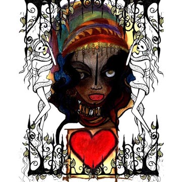 Grace is the beauty of form under the influence of freedom
//Saturday, May 12, 2007 12:57 AM
Project 2
A 15 to 20s commercial Project duration: 3 weeks and due on week7 010607 1) advertisement thats is for a product/ service 2) ad has to be driven by 2 opposing emotions such as freedom and oppression. 3) text and words are not allowed 4) research on 8 ads.Look out for unique selling points, brand identity, visual imageries etc. 5) create colour mood board 6) only present wif sound on third week. 7) final presentation: output to be in dvd format
//Sunday, May 06, 2007 10:40 PM
 Contrast is the dissimilarity or difference between things. Another meaning for contrast is in the context of colour. This can be the opposition of items that are compared or the act of distinguishing via differences comparison.It helps object to be distinguishable from other objects and the background.I feel that visual contrast provides an 3D depth to the image to create an realistic touch and feeling into the picture.The visual contrast also help to animate the 'motion' in the composition.Without it the whole composition will be very 'flat' and lifeless. Contrast is the dissimilarity or difference between things. Another meaning for contrast is in the context of colour. This can be the opposition of items that are compared or the act of distinguishing via differences comparison.It helps object to be distinguishable from other objects and the background.I feel that visual contrast provides an 3D depth to the image to create an realistic touch and feeling into the picture.The visual contrast also help to animate the 'motion' in the composition.Without it the whole composition will be very 'flat' and lifeless.For this composition the main theme is Fossil.If the author were to use colours that consist of black and white, the audience would not be able to recognize the main objective which is the 2 bugs somewhere near the middle.And for not wanting the bugs to be interpreted as normal bugs only, the author decided to use the fossil colour to represent it all.I feel that colours are important as they help to create moods that one maybe is seeking.Colour contrast also helps to create the main focus/ divert attention. Too many colours will make the composition feel too busy and it usually makes it harder for the viewer to find the information he or she wants. It is also more tiring to the eyes.While A composition with too few colours, on the other hand, might risks being seen as a bit boring. For example, in this picture,the author added more vibrate/more striking colours to his main objectives- the 2 bugs.   Colour Studies Colour StudiesTexture efers to the properties held and sensations caused by the external surface of objects received through the sense of touch. Texture is sometimes used to describe the feel of non-tactile sensations. Texture can also be termed as a pattern that has been scaled down (especially in case of two dimensional non-tactile textures) where the individual elements that go on to make the pattern not distinguishable.To me, I feel that texture too, create an 3D feeling and helps to create an realistic feeling to an overall composition.
// 9:53 PM
DESFUN
// 9:49 PM
You need to have your 6 explorations of the REPETITION exercise ready BEFORE class and pin it up on monday morning.
From your six explorations, you will choose ONE that you think is most interesting...this will be the one that you will be animating in class using after effects. (all these will be considered under your participation grades for the module) 2. You also need to complete this week's exercise as we will continue with it , adding value, texture, colour. You should already have the six explorations on SIMPLIFICATION pin up in class (all these will be considered under your participation grades for the module) IN YOUR PROFESSIONAL BLOG include the following with heading under DESFUN A) i)forms from nature & ii) design inspired by forms of life. B) From a screen shot of motion graphics clip or any illustration, graphic design or artwork, study how -visual contrast, -colour and -textural elements has been used to enhance the visual message. (all these will be considered under your participation grades for the module) |
|
|


