|
Welcome /
trash welcome you here into her thoughts she welcome any interested parties to hire for freelance be it branding,motion graphics or any forms of video making. mgbd nyp drop her a email at artaz_aq@hotmail(dot)com for anything that needs a password: trash This site is best viewed in 1280x768, Mozilla Firefox View My Stats Tagboard /
Links /
pohfong audrey sister chow fern shawna hui xiang agnotti serene ernie evol natasha daniel nique marcus qing he jasmine randy jia en cherine yiling Archives /
April 2007May 2007 June 2007 July 2007 August 2007 September 2007 October 2007 November 2007 December 2007 January 2008 February 2008 March 2008 April 2008 May 2008 June 2008 July 2008 August 2008 September 2008 October 2008 December 2008 March 2009 April 2009 August 2009 Recent
moved!! because of problems publishing post at blo... been wondering and day dreaming for too long. I re... This excellent work is from 25 y.o Russian photogr... !Motion graphics.part 1Long time never really upda... Seeking out the beauty from withintime portrays th... Stillness interesting composition from show57. Very mtv for ... Chief Creative Officers of Ogilvy & Mather help yo... love the use of raw and colorful dynamic lines to ... Credits /
This skin is produced by Headlight Productions. The icons are from Three More Steps. All codes are meticulously hand-coded, and can not be used as basecodes or reference. All css and javascript in the code passes validation.© Copyright Headlight 2008 - Forever. All Rights Reserved. |
//Monday, October 29, 2007 4:24 PM
  Rolls Royce Logo Rolls Royce is a global power systems company ‘providing power for land, sea and air, with leading positions in civil aerospace, defence, marine and energy markets’. Rolls Royce Ltd. laid its foundation in 1906, when the founders of the company, Charles Rolls and Henry Royce, agreed to work together on a range of Rolls Royce cars. Since then, Rolls Royce has become a ‘motoring legend’. The Rolls Royce logo consists of two ‘R’s or doubles ‘R’ which apparently stands for Rolls and Royce. Though the Rolls Royce logo was simply designed, the name is so powerful that the Rolls Royce logo looks attractive and distinctive. There is, however, an ambiguous quality to the Rolls Royce logo that is often neglected. The name “Rolls Royce” in the Rolls Royce logo is always written complete with a hyphen. That’s because ‘the hyphen’ symbolizes the partnership or the link between the two founders. In a more profound meaning, the hyphen in the Rolls Royce logo represents Claude Johnson, ‘a recognized authority on motoring matters at the time of the company's formation and the man who is accredited with building the name into what it is today’. Although not used with the Rolls Royce logo, “The Spirit of Ecstacy” or “The Flying Lady” is also an important element of Rolls Royce. It was designed by Charles Sykes as a statue to embellish Rolls Royce cars. The mascot was commissioned by Claude Johnson to ‘counteract a craze among motorists for fixing golliwogs, toy policemen and other unseemly objects to their cars’. The Rolls Royce logo and ‘The Spirit of Ecstacy” had adorned the radiators of Rolls Royce motor cars since 1911. No doubt, the Rolls Royce logo has been a huge hit.
// 4:21 PM
 Chanel Designer Logo ‘The house of Chanel’ is a popular French designer house established in Paris, founded by Gabrielle Bonheur “Coco” Chanel. The Chanel fashion house is world famous for its line of clothing, perfumes and other fashion accessories. The Chanel designer logo is an interlocking back-to-back, overlapping double C. Coco Chanel herself designed it in 1925, based on her own initials. This logo is by far the most famous and widely recognized designer logo in the world. It is continually projected on many of Chanel’s designer accessories. Due to its boldness and simplicity, it has managed to leave an imprint on many people’s minds. This designer logo is classy and distinctive, and successfully portrays the house of Chanel as an iconic fashion brand.
// 4:18 PM
 Mercedes Benz Logo The Mercedes Benz logo was originally created by Gottlieb Daimler and was featured in 1909. The Mercedes Benz logo consists of a simple depiction of a three-pointed star that represents ‘its domination of the land, the sea, and the air’. After Daimler’s death, his partner, Wilhelm Maybach, took over the company and sold many Daimler cars with the help of Emile Jellinek. Following the success of Daimler cars among Jellinek’s wealthy acquaintances, Jellinek suggested Maybach to create light, lower and more powerful cars which he named after his elder daughter, Mercedes. That’s how the Mercedes logo got its name. After the merger with Benz & Cie., the Mercedes logo was introduced with an addition of the Benz laurel wreath in 1926 to signify the union of the two firms.
// 4:12 PM
  New Chicago Olympic logo 2016 The new Chicago Olympic logo is without the torch; however the identity is still prolific with a six pointed star taking center stage. This icon is similar to the star in Chicago’s flag. Earlier, the previous logo that featured the Olympic-style torch was ruled out by the International Olympic Committee, as it was against the Olympic emblem/logo rules which state that candidate city logos cannot contain any Olympic symbol. This includes the Olympic flag as well as any other imagery related to the Olympics such as a flame, torch, rings, medal, and so forth. Even though the imagery has changed, the color palette has remained the same. According to the design team of the Chicago Olympic logo, the colors were kept the same as they maintained a brand identity. Also, the slogan “Stir the Soul” will continue to be used. The dominant white star in the new Chicago Olympic logo symbolizes a beacon and guiding light perfectly. It also represents athletic greatness. The star on the Chicago Olympic logo is set against bands or ribbons of color, which signify award ribbons and medals that athletes achieve in the games. The color palette is used to denote the same concept portrayed within the previous logo; the yellow represents the city’s architecture and sky line. The red color is employed to show passion for sports whilst the green and blue below stand for the city’s parks and the Michigan Lake respectively. The points of the Chicago Olympic star are meant to be a symbol of hope, harmony, respect, friendship, excellence and celebration. According to the Mayor of Chicago, the new Chicago Olympic logo will become “a great symbol for the city and nation”, as they strive towards attaining the opportunity to host the Olympics and Paralympics. The new Chicago Olympic logo is a highly visible, striking and recognizable identity for Chicago’s bid efforts. The imagery as well as the pertinent concepts it presents prove to be very successful. The new logo has been received well by most and VSA have shown us that a hat trick can take place by finding a worthy replacement for the torch in the Chicago Olympic logo.
// 4:08 PM
    UPS Logo The first UPS “shield” logo was created in 1916 when its founder Jim Casey merged the company with a local rival delivery service. That UPS logo featured a shield and an eagle carrying a package with the words “SAFE, SWIFT, SURE” inscribed on the side. The famous shield used in the first UPS logo continues to be used even today and UPS employees often refer to the UPS logo as ‘the shield’. The second UPS logo was introduced around 1937 and displayed “UPS” for United Parcel Service on it. By that time, the company had grown enormously and was also providing delivery of merchandise for multiple retail department stores. Thus the phrase, “THE DELIVERY SYSTEM FOR STORES OF QUALITY”, was later incorporated in the UPS logo to signify the growth of the company. Renowned brand designer, Paul Rand, designed the third and more simplified version of the UPS logo in 1961. The newly renovated UPS logo featured ‘a bow-tied package above the familiar shield to express the mission of the company’: of offering package delivery as its sole service. ‘As part of the rebranding, UPS adopted its fourth UPS logo, marking the first change in the UPS logo in 42 years’. On March 25, 2003, UPS with the help of FutureBrand, unveiled its new corporate identity with a new UPS logo. The most significant change, in the new UPS logo, was the removal of the bow-tied package above the UPS shield. Ironically “the bow”, which had become one of the most recognized features of the UPS logo, has been subjected to refusal by UPS over decades as the string refrain UPS’s abilities to represent itself in various supply chain services. Additionally, though the decision for its removal is not entirely based on this, the string in the bow-tied package can get caught in UPS’s high-speed sorting machinery. The new UPS logo symbolizes UPS’s expansion from package delivery into a broader array of supply chain services. But one thing in the UPS logo that has remained constant is its logo color and that is brown. The Brown color in the UPS logo is the trademark of the company and is often erroneously referred to as Pantone color 0607298 (0607298 is not a valid Pantone number). While brown is the primary color of UPS, other new, complementary colors were also introduced to the designs of other UPS company assets such as aircraft and packages. The current UPS logo express speed; and its transformation is one of the most significant achievements made by the company. No doubt, the UPS Logo is one of the most seen and recognized brands on the globe.
//Sunday, October 28, 2007 9:23 PM
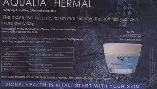
Spin: Health is important especially your skin, so you must use Vichy to help you. Spin: Home Bound Healthcare is the only home that provides all round help and treat patient like human beings
//Friday, October 19, 2007 7:59 PM
Differences between a weekday and weekend paper I think the differences between weekdays and weekends Today newspapers are the contents, designs and the way the present their stuff. Today make use of the weekend issues when people tend to have more free time to draw more attention as compared to their weekday issues.They foresee that this is a good opputunity to catch their attention as they are also more willing to spend their money to relax.But, in order to do that, they will have to impress their readers at first sight to catch their attention to read it. Thus they inserted more graphics and pictures to make it more eye-catching. Content wise, they have more in depth coverage of the latest and hottest news, real-life stories that are closer to the heart.Because of the potential amount of people reading the papers and having the desire to go and "chill", more advertisement, content on the lifestyle section, entertainment news and cinema screening schedule were published.To add on to that, there are also weekend special feature on the best hideout and places for food and dining.For example: Where to get the best and unique ice cream in town.News on the on's and happenings of fashion, jewellerys, cars and travel are also only featured on the weekends papers. *Weekday papers only got the minimum of what the weekends papers. Gonzàlez-Harbour said that the daily paper was too stacked towards politics, and that it didn't yet know how to give space to different areas like science, culture or gastronomy. "We've been able to find that voice in the weekend edition, and perhaps we need to export it to the weekday edition too."http://www.editorsweblog.org/editors_forum/2006/06/qa_weekend_editions_session.php Yeah i agree with that.
// 5:53 PM
Newspaper spins
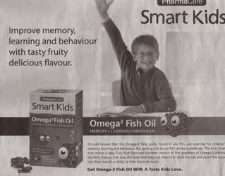
"Effective within 3 days & Rebirth of Wellbeing in 30 days." (spin : You will be the healthy quicky only with avalon -AVALON- "Kidabion Kids Loves Challengers" ( spin : only kids that that takes kidabion loves challenges)-Kidabion OMEGA-3 Fish Oil- "ENJOY THE BEST OF EUROPE, AUSTRALIA & NEWS ZEALAND WITHOUT EVER LEAVING SINGAPORE.oNLY WITH THE FINEST INGREDIENTS, SOURCED FROM ALL AROUND THE WORLD GO INTO YOUR FAVOURITE DRINK.MADE IN SINGAPORE SINCE 1984, MILO COMBINES A GREAT CHOCOLATEY TASTE WITH A PERFECT MIX OF ACTIGEN-E THE ULTIMATE BLEND OF B VITAMINS AND MAGNESIUM.IT'S ALSO WON HEALTHIER CHOICE STATUS FROM THE HEATH PROMOTION BOARD AS WELL AS THE HEARTS OF ALL SINGAPOREANS.EACH AND EVERY YEAR, WE INVEST $1.7 BILLION ON RESEARCH WORLDWIDE TO DEVELOP QUALITY PRODUCTS THAT IMPROVE YOUR QUALITY OF LIFE. SO YOU CAN ALWAYS ENJOY ALL THE NATURAL FLAVOUR OF THE PUREST, MOST TASTY INGREDIENTS THE WORLD CAN OFFER YOU, IN YOUR OWN HOME.UNCOMPROMISING QUALITY." ( spin : milo is the best outta the best )-Nestle MILO- "Allow your child to grow naturally.The new advanced Mamil Gold with IMMUNOFORTIS." ( spin: only children that drinks mamil gold can grow properly) -Dumex- "Face the world Beautifully" "New York bought out the true beauty in me" (spin: your inner beauty is not impoartant only the outer is and new york skin solutions is the only one that can help you.) -New York Skin Solutions-
//Tuesday, October 16, 2007 2:35 PM
Toyota- A Car to Make your Own
1) They are trying to brand their cars as the best and most popular that everybody fight for it. 2)VIOS A advertisemenet from Toyato too which tries to brand itself as the best and most popular that everybody wants it. 3) Honda accord Honda is trying to brand itself as a company that make cars that is flawless. 4)Auto emocian- Sert Panda This company is trying brand its cars as cars that is the same as high-class cars. 5)Hyundai Branding itself like saying it's car is the best that you will still choose it in the end.
// 2:35 PM
//Friday, October 05, 2007 1:42 AM
where does inspiration come from? is it from your everyday life? is it when you are walking down the street? is it when you are using the toilet? is it when you are dreaming? Inspiration [ ĭn'spə-rā'shən] - Something, such as a sudden creative act or idea, that is inspired. I think that inspiration comes from everyday, everywhere. It comes from every detailed observation from even the simplest matter. Anything around you can just trigger off your imagination. Anything in your surroundings can be the next big thing in the industry you will be working on. I feel that to go big doesn't mean that you need to follow the trend. One should start from learning to explore and observing the happenings around you. Even a small action of putting a hairclip on your toe can trigger off some imagination and inspiration. When you feel frustrated over something, think deep and you will find that you will be able to form a composition of an image out of it. People tend to neglect their surroundings and who they really are when trying to find inspiration. This resulted in no personal style and original creativity and concepts. Making most of the works out there all seem to be like a copy of one another. So how do you get inspiration to come to you??? Taking a walk or going window shopping down town may help. just LOOK, OBSERVE and THINK. There's no use in sitting at home and stare at blank space or in front of your monitor screen. Sometimes sitting at home talking to your family might work too. Always keep a notebook with you to jot down every detail of your life. Sometimes this is where you will find your inspiration.
//Wednesday, October 03, 2007 12:24 PM
// 12:13 PM
|
|
|


