Welcome /
trash welcome you here into her thoughts she welcome any interested parties to hire for freelance be it branding,motion graphics or any forms of video making. mgbd nyp drop her a email at artaz_aq@hotmail(dot)com for anything that needs a password: trash This site is best viewed in 1280x768, Mozilla Firefox View My Stats Tagboard /
Links /
pohfong audrey sister chow fern shawna hui xiang agnotti serene ernie evol natasha daniel nique marcus qing he jasmine randy jia en cherine yiling Archives /
April 2007May 2007 June 2007 July 2007 August 2007 September 2007 October 2007 November 2007 December 2007 January 2008 February 2008 March 2008 April 2008 May 2008 June 2008 July 2008 August 2008 September 2008 October 2008 December 2008 March 2009 April 2009 August 2009 Recent
moved!! because of problems publishing post at blo... been wondering and day dreaming for too long. I re... This excellent work is from 25 y.o Russian photogr... !Motion graphics.part 1Long time never really upda... Seeking out the beauty from withintime portrays th... Stillness interesting composition from show57. Very mtv for ... Chief Creative Officers of Ogilvy & Mather help yo... love the use of raw and colorful dynamic lines to ... Credits /
This skin is produced by Headlight Productions. The icons are from Three More Steps. All codes are meticulously hand-coded, and can not be used as basecodes or reference. All css and javascript in the code passes validation.© Copyright Headlight 2008 - Forever. All Rights Reserved. |
//Thursday, November 22, 2007 7:05 PM
// 7:01 PM
// 6:17 PM
Cool Stop-motions Between You and Me - dir. by Patryk Rebisz Award-winning short film shot with still camera. Over 2000 photographs were stitched together to form movement. This video can be found at http://photojojo.com/content/tutorials/stop-motion-digital-camera/ "Lets Build a Fire" music video
Music video for Plus/Minus band. Over 170 pictures were burnt to achieve this effect. The footage of burning too was shot with still camera and later stitched together to form movement.
//Wednesday, November 14, 2007 7:06 PM
Julien Pacaud While searching on the net i found a artiste's weebie that was recently featured in IDN. His works are really a wow! It's really quite fascinating on how u can create with just scraps of images from different places, a personal style thats really cool. Hmmm, makes me wonder what a personal style is and what is my own personal style? Do i have one?
CD artwork pour l'album de Venus Paradise "Electric Melody" (label : Slalom Music - 2006) Illustrations for New York Times Style magazine, Fall 2007 Illustrations pour l'Equipe Magazine daté du 05 août 2007 This is really cute on how this guy do it in this weird manner haha!
// 7:02 PM
// 6:53 PM
Creating a Realistic Looking Object Using V-Ray In 3D Studio MaxDifferent sites for different type of fonts
http://cg.scs.carleton.ca/~luc/fonts.html
//Tuesday, November 13, 2007 7:57 AM
IS it effective? I think think commercial is effective as it catches people's attention by the use of sex, humor and framing. By the use of sex and humor, they were able to generate attention.The target market alos does not need to have background knowledge of their products as the message is simple.Though humor is used, it is relevant to the selling point of the ad. It also stresses the uniqueness of the product which is the waterproof camera by surprising customers who typically refuse traditonal appeals to ads(Appeals more towards teenagers and young adult). It surprise the target audiences with an unusal approach by disrupting, then reframe the offer.By reframing the offer, it focuses on the offer rather than the choice. However, I think this ad in some ways, not effective too. Some people might think that the ad is gross not funny after watching,creating negative impression. This might be good too as people remember the too but, in the negative way. Thus on the whole, i conclude that the ad is effective as it manage to catch people's attention and at the same time allows people to remember what kind of product and its feature they are selling.
//Sunday, November 11, 2007 11:39 PM
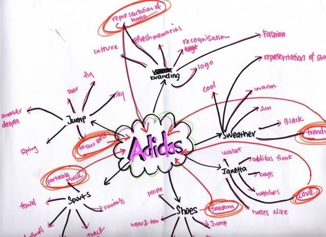
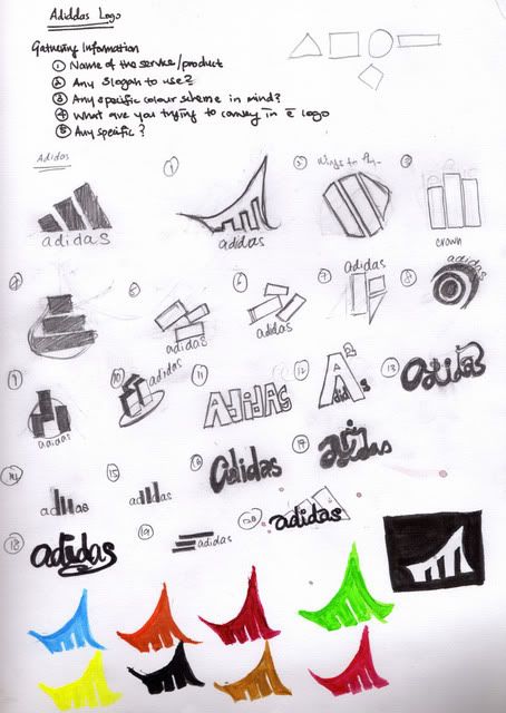
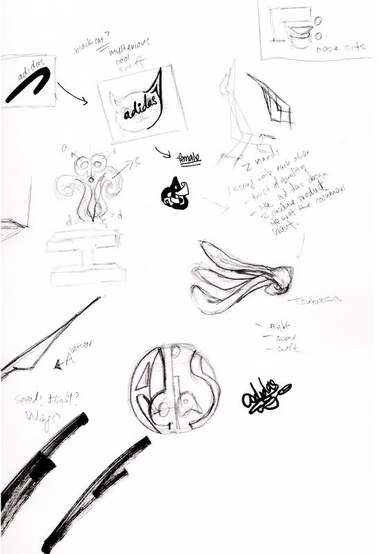
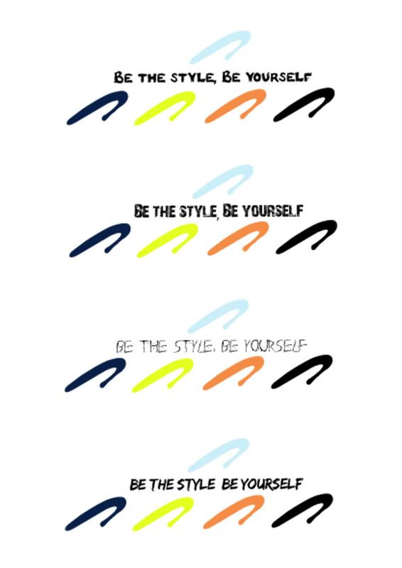
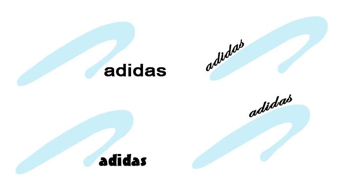
Main theme: fashionable appealing to women Meaning of the Logo: represents the Adidas's "a" an upward glide to represent 'forwardness' and 'fast' and to rinse up to the top. the blue to represent the 'young at the heart'. to some extend, the logo look like a high heel representing women.
//Monday, November 05, 2007 11:05 PM
The 2 Best Spins
"ENJOY THE BEST OF EUROPE, AUSTRALIA & NEWS ZEALAND WITHOUT EVER LEAVING SINGAPORE.oNLY WITH THE FINEST INGREDIENTS, SOURCED FROM ALL AROUND THE WORLD GO INTO YOUR FAVOURITE DRINK.MADE IN SINGAPORE SINCE 1984, MILO COMBINES A GREAT CHOCOLATEY TASTE WITH A PERFECT MIX OF ACTIGEN-E THE ULTIMATE BLEND OF B VITAMINS AND MAGNESIUM.IT'S ALSO WON HEALTHIER CHOICE STATUS FROM THE HEATH PROMOTION BOARD AS WELL AS THE HEARTS OF ALL SINGAPOREANS.EACH AND EVERY YEAR, WE INVEST $1.7 BILLION ON RESEARCH WORLDWIDE TO DEVELOP QUALITY PRODUCTS THAT IMPROVE YOUR QUALITY OF LIFE. SO YOU CAN ALWAYS ENJOY ALL THE NATURAL FLAVOUR OF THE PUREST, MOST TASTY INGREDIENTS THE WORLD CAN OFFER YOU, IN YOUR OWN HOME.UNCOMPROMISING QUALITY." ( spin : milo is the best outta the best )-Nestle MILO- Reason: The "!" alignment makes the viewers curious of what its abt.After reading it makes the consumers feel that they will or are consuming the bestbest stuff of all the other company's products especially by looking at their first sentence which is the most visible by the "!" alignment of the ad. "Allow your child to grow naturally.The new advanced Mamil Gold with IMMUNOFORTIS." ( spin: only children that drinks mamil gold can grow properly) -Dumex- Reason: I think this is really effective in which how they target the parents.As parents all want the best for their kids so i think that it's easy for them to fall into this spin.To say the truth, i only found out the spin after i took a closer look at it.
//Sunday, November 04, 2007 12:22 AM
Creative Nonsense
tennis_court by night |
|